Your home is more than a structure — it’s a personal sanctuary where your daily rhythms unfold. But what if the way your home feels isn’t just about design or furniture, but about color? The tones you choose for your walls, furniture, and accents play a powerful role in shaping your mood, energy, and focus. That’s where color psychology comes in. If you’ve ever felt instantly relaxed walking into a spa-like bathroom or energized in a sunny kitchen, you’ve already experienced the effect of color on your emotions. Understanding how to use color psychology can help you create a home that looks beautiful and feels aligned with your lifestyle.
This guide walks you through the practical and emotional aspects of color psychology, giving you the tools to transform each room with intention. Whether you’re redesigning a space or refreshing a corner, the right color choices can help you feel more inspired, at ease, and truly at home.
What Is Color Psychology?
Color psychology is the study of how different hues influence human behavior, perception, and mood. It’s widely used in branding, marketing, and therapy, but it also plays a significant role in interior design. Each color elicits different responses based on associations, personal experiences, and innate reactions. In the context of home design, you can harness this to evoke calm, motivation, warmth, or clarity, depending on the effect you want in each room.
There are no one-size-fits-all rules, but color psychology offers a solid foundation for making thoughtful design decisions. Once you understand the emotional power of color, you’ll begin to see your home as a dynamic environment that can actively support your daily routines and long-term goals.
The Meaning Behind Popular Colors
To use color psychology effectively, it helps to understand the emotional associations behind the most common colors in home design. Here’s a quick breakdown of what each one tends to evoke and where it works best.
Blue
Blue is linked to calm, clarity, and focus. It lowers heart rate and reduces stress, which makes it ideal for relaxing spaces. Lighter blues tend to feel airy and peaceful, while darker navy tones can introduce sophistication and depth.
Green
Green symbolizes renewal, balance, and growth. Because it mimics the colors of nature, it often feels refreshing and grounding. Use green in kitchens, living rooms, and entryways to create a sense of ease and restoration.
Yellow
Yellow brings optimism, energy, and warmth. It reflects natural light and can uplift the mood — perfect for kitchens, breakfast nooks, or small spaces that could use a cheerful boost. Be cautious with overly bright yellows, which can feel overwhelming in large doses.
Red
Red is intense and attention-grabbing. It raises energy levels and stimulates conversation, which makes it well-suited for dining rooms or entertaining areas. Deep burgundies offer drama and elegance, while true reds make a bold, unapologetic statement.
Orange
Orange combines the excitement of red with the friendliness of yellow. It evokes creativity and enthusiasm, often used in home gyms, hobby spaces, or accent pieces where a pop of energy can inspire movement and joy.
Purple
Purple suggests luxury, imagination, and serenity. Light lavender tones feel tranquil and dreamy — ideal for bedrooms or quiet nooks. Rich purples, like plum or eggplant, bring in depth and refinement when used sparingly.
White
White conveys cleanliness, simplicity, and openness. It reflects light, making spaces feel larger and more expansive. While all-white spaces can feel sterile without texture or contrast, a well-balanced white room exudes calm and timeless elegance.
Gray
Gray is neutral, modern, and versatile. It works well as a base color that complements both bold accents and soft pastels. Warm grays feel cozy, while cool grays lean more minimal and sleek. Use it to balance strong color choices or establish a refined, contemporary look.
Black
Black signals sophistication, intrigue, and mystery. Though often used sparingly, black can add drama and structure to a room. It works especially well in small doses, like on trim, cabinetry, or a statement wall.
Designing Each Room With Purpose
Each room in your home serves a unique function, and your color choices should reflect that purpose. When you align your paint and decor with your intentions for the space, you amplify both its beauty and its usefulness.
For instance, the living room is often the central hub of the home — a place to relax, entertain, and connect. Choose warm, grounding tones like soft greens, beiges, or warm grays here to invite comfort and conversation. If you want more vibrancy, add strategic pops of orange, navy, or mustard through throw pillows, artwork, or an accent chair.
Meanwhile, the kitchen thrives on energy and brightness. Sunny yellows, light greens, and even terracotta tones can make this space feel welcoming and vibrant. If you prefer a clean and modern look, combine crisp whites with natural wood tones and accent with bold hardware.
The bedroom should be a true retreat that encourages rest and relaxation. Soft blues, muted lavenders, or earthy greens promote calm and stillness. Keep lighting in mind as well. Colors that look subtle and warm in natural light may appear more intense under artificial bulbs.
Spa-inspired hues like soft gray, pale blue, and white can make your bathroom feel fresh and serene. Consider incorporating natural elements, such as wooden accents or greenery, to enhance the tranquil effect.
For your office, remember that productivity and mental clarity thrive in well-lit, focused environments. Blue tones are especially helpful here, as they enhance concentration. If you want to add a dose of creativity, bring in warm orange or yellow accents in small ways — think artwork, a lamp, or a desktop accessory.
To encourage conversation and appetite in the dining room, go bold. Deep red, terracotta, or warm gold can make a dining space feel dynamic and inviting. If you’re working with a smaller space, an accent wall or a dramatic ceiling can add visual interest.
Don’t Forget About Lighting
Color doesn’t exist in a vacuum. The way you perceive it depends heavily on the lighting in your home. Natural light changes throughout the day and can make the same paint color appear soft and creamy in the morning and then cooler and more dramatic by evening. Artificial lighting — whether warm or cool — also alters how a color reads.
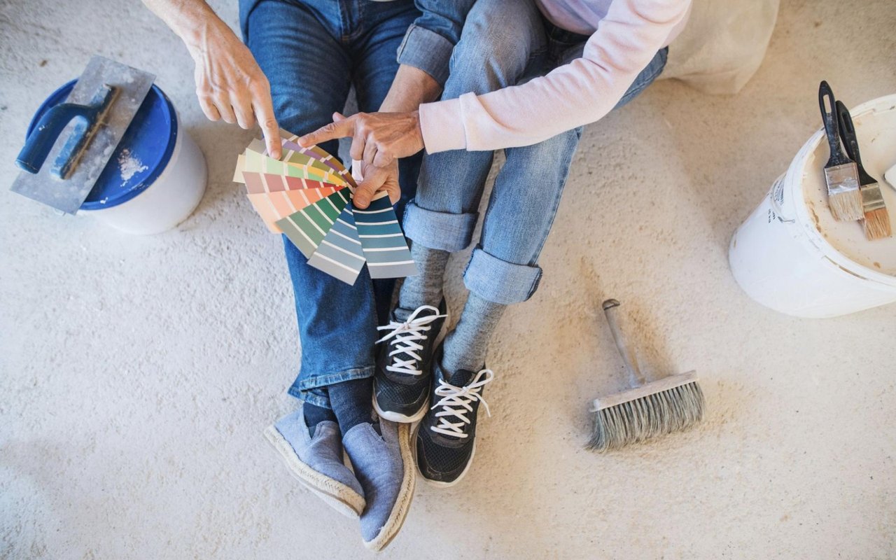
Before committing to a paint color, test swatches in different parts of the room at different times of day. Look at how the tones shift with morning light, overhead fixtures, and lamplight. This small step can help you avoid costly repainting or a look that doesn’t quite match your vision.
Staying True to Your Style
Trends in color come and go, but when it comes to transforming your home, the most important voice is yours. Think about how you want each space to feel. Do you want to feel energized, grounded, inspired, or soothed?
If a color makes you feel something positive, it’s a great choice, regardless of what’s currently trending. Lean into your intuition and use color as a way to tell your story. When your choices reflect your personality and lifestyle, the results feel authentic and timeless.
Transform Your Home, One Shade at a Time
Color has the power to shape your home and your daily experience within it. By understanding color psychology and applying it with intention, you can design spaces that support the way you want to live, think, and feel. Whether you want a serene escape, a motivating workspace, or a vibrant gathering place, your palette can bring those goals to life.
If you’re ready to find the perfect home in Scotch Plains, NJ, Jill Skibinsky is by your side.